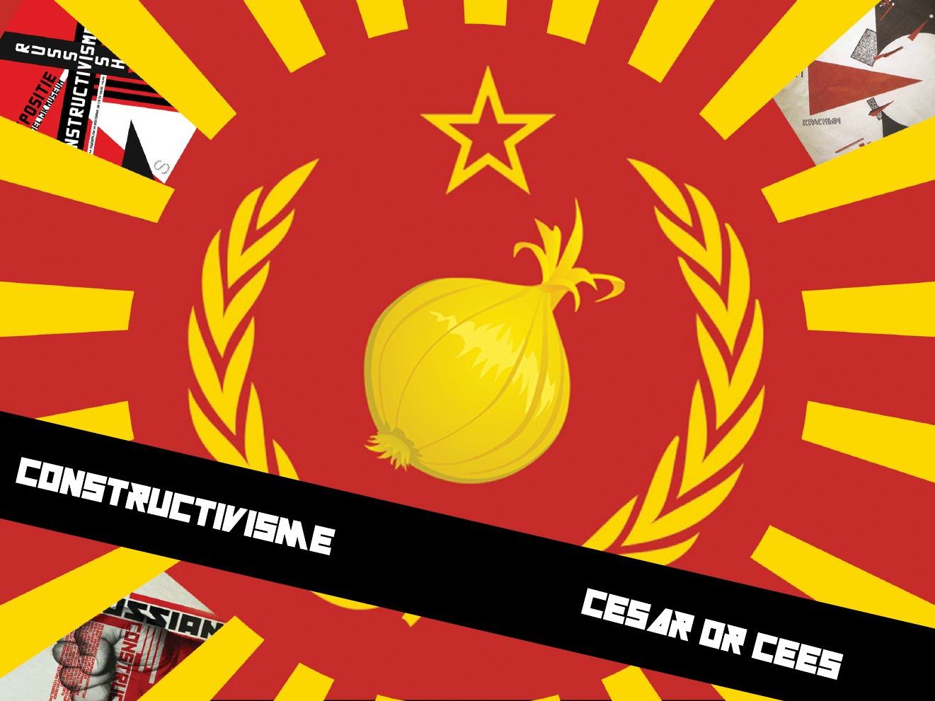
A single-page website for a fictional onion restaurant, designed in the style of Russian constructivism.
Assignment
In the visual design course each student got a style to work in. Mine was constructivism: bold diagonals, red, black and cream, geometric shapes and heavy type. The brief asked for a moodboard, sketches and a single-page website in that style.
Process
I started with a mind map and sheets of loose shapes, then combined them into compositions inside squares. Alongside that I drew the onions and dishes that became the illustrations. Feedback after each lesson shaped the layout.
Result
The final design puts a golden onion in a laurel wreath, a nod to Soviet emblems, on a background of red and yellow rays. The website carries the same diagonals into a menu, an agenda and a contact form.
Process report
From first sketches to the website (in Dutch). Tap a page to see it large.