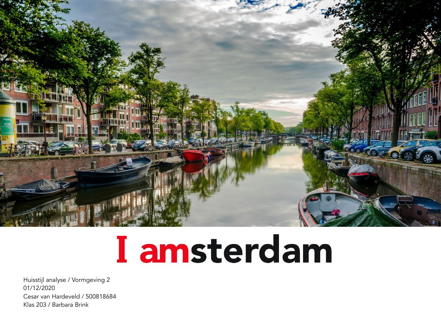
An analysis of the I amsterdam house style, and a responsive website design that follows its rules.
Analysis
I took the brand apart: Avenir in six weights, the red, white and grey label variants with their colour values, the use of shapes, the photography, and the name and logo.
Design
With those rules I designed pages for desktop, tablet and phone. The red label anchors every page, and the photography of the city carries the rest.
House style analysis
From analysis to page designs (in Dutch). Tap a page to see it large.